Hello!!

My photo
I'm 23. I don't quite know yet........

desmond wong

A recent graduate at Goldsmiths University doing something called Design.

This is the blog of design graduate Desmond Wong at Goldsmiths, University of London. This blog showcases the projects Desmond had been working on in the past recent years.

Tuesday, 22 December 2009

Workshops.3


Here are the documents where I comprised the sketches and outcome into garphic record. The projects included here are:

Design Debate: Design SHOULD be Playful
Object Fiction
Film Week: Adventure of a Schizophrenic Camera


Friday, 18 December 2009

Brief Document

Here is the revised graphics for our final year design brief.

The size is limited A5.


Thursday, 17 December 2009

Sunday, 29 November 2009

A belated 'Reflection' Week


Have I missed out anything?

Thursday, 26 November 2009

Adventure of a Schizophrenic Camera

The video explores the scenario in which a very human mantle disorder, Schizophrenia has invaded a machine. How will it function and what can we gain from these clips?

Over Exposed, Higest ISO and super-impose back images
Continuous Images

Adventure of a Schizphernic Camera from Desmond Wong on Vimeo.


Saturday, 21 November 2009

Workshop with El Ultimo Grito

We were asked to merge objects found from pound shops and to devise a context with the newly formed objects completed with a 300 words context/story.


Click on the image below to read the story:


This project for me is about how form has a language which while merged together we can knit a new narrative. The story and the object were mutually driven.

Friday, 13 November 2009

Design SHOULD be Playful!

This week we were to come with with an argument which support the above slogan. The goal of this debate is to win votes against the our opposing teams 'Design should NOT be playful'.


Obviously we won as we have our prob, the 'Para-Mug'. Never smash a mug again.

Sunday, 8 November 2009

Beginning of a Beginning

We have finally started to look at our final year project and finding out our area of concern. Here is my starting point extracted from the NewScientists 24 October 2009.


Although it started off with the broad subject of time perception, I have now concentrated on the effect of it in relation to schizophrenia

Wednesday, 28 October 2009

Forgotten Craft, Drawing as a Creative Process

Here is the project as part of the double project thing with ICTTE. I'm trying to find a new understanding of drawing.


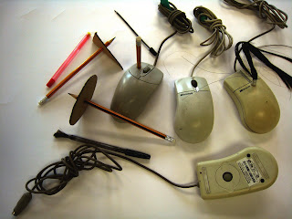
During the exploration of drawing through an ordinary pen and the modern Adobe programs such as Illustrator and InDesign I noticed the difference between how our drawing tools dictate our thinking process. I sat up various experiments and found out that while we draw with a pen on paper, our movements/thoughts are more continuous and organic. However, as soon as we use a mouse the process become a disjointed and calculated thought, as one has to work out the logistic of the program and figure out the most ‘convenient’ way to achieve the goal. It is driven by numbers and equation.

Therefore, I was interested how one could explore and exploit this idea of ‘convenience’ in the world of hand-drawing. I have created these new set of swatches by dismantling the different element in the movement in drawing and gave them numerical indicators. By doing so I hope to encourage a new way of thinking in which one explores drawing movement in numbers and turning these continuous chains of thoughts into data. Then it is up to the user of this chart how they would like to take these data forward.

ICTTE, Intergrating Culture Through The Everyday

Just a little project on marriage of cultures.

100% Design with Decode

Here is some pictures in 100% with Decode where I worked for a months.

Thursday, 3 September 2009

Design Week 18.08.09


In reference to our Nokia Project with kin, we managed to get a small mention in the magazine thanks to the lovely Matt and Kelvin.

Friday, 19 June 2009

Michael Sodeau Partnership

Just doing my placement at the moment for 2 months. I'll be back soon. 2 more weeks to go!


Tuesday, 31 March 2009

1st Year Stop Frame Animation

This is just a stop frame animation me and Matt West did for our Moving Image workshop. A little clip inspired by the news.

Thursday, 26 March 2009

Revisiting Anti-Social Lambeth


4 Months has gone since my intervention in Lambeth and I decided to give it a visit. I was a pleasant surprise that people were sitting there on my bench and someone has made my temporary fixture attach to the wall properly, as I only hooked it on while I executed the intervention.

This was the result I wanted as my intervention has created a respond. Therefore I decided to push the idea forward by adjusting the campaign slightly. I have created these Renovation Tags where people would attach them onto the fixture every time they renovate them. This creates a ‘conversation’ between the unknown people within the community, giving the park what it once lacked, the interaction between people and people, and the interaction between people and space.

Revisiting Aquaphobia

U'n'-Brella Spillage Absorber
Cutlery Guards

During the design process of this project, there were a few different ideas we touch on. Upon evaluation, I realise the outcome was too generalised and somehow lost in all these unfamiliar ideas, resulting in a product that has lost its narrative and became lifeless.

In an attempt to produce a alternative outcome, I decided to choose a different route and create a narrative for my objects. What would an existing product look like or function if it was made for extreme aquaphobia sufferers? The new outcomes are a range of household products (prototypes) that allow the users to look at, and ‘enjoy’ their fear through a comedic alternative outlook.

Cutlery Guards: Stop the juices of meat and sauce leaking onto your finger while dining.

Spillage Absorber: It absorbs the spillage from glasses before it reaches your hand.

WashingUp Armour: Fully covers your upper body for washing up.

Hand Dry Tooth Brush: The unique design allow the water to drip away rather then leaking onto your hand.

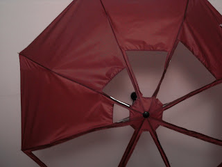
U’n’-Brella: An umbrella that allows you to decide you the amount of rain you have in contact.

Thursday, 12 March 2009

kin x nokia Interactive Seating Installation


After the midway presentations and feedback we received, we proceeded with an idea for a circular interactive seating area. We felt that the seating needed something extra in order to illustrate the whole concept of the Social Location technology, so we revisited our rejected concepts for elements we could glean. We decided to use the space within the ring to include an interactive floor to further attract and captivate the attention of passers-by.

· Initially the projection in the centre shows words randomly floating around.When a person sits down, the area around them illuminates and the words on the projection swarm towards them.

· When another individual joins them, the area around them also illuminates, as well as the space between them. Connecting them through light. The words are also attracted by the second person and form trails between them.

· The words ask and answer the question ‘What are you doing?” creating a fictional conversation.

The same principal applies when more people join the seating.

To quote Nokia:

“People want to be truly connected, independent of time and place, in a way that is very personal to them. And, Nokia’s promise is to connect people in new and better ways.”

Our idea captivates people’s attention by providing them with somewhere to rest in a busy exhibition, and an interactive experience which becomes increasingly interesting as more join in. By visualising connections through light and text it creates opportunities for interaction with unpredictable outcomes.
Creative Team:
NEAL, Clair
O'NEIL, Avril
RUPP, Jacquie
WONG, Desmond

Thursday, 19 February 2009

Live Project: kin + Nokia (midway presentation)


Here are some sketches and images of the initial idea.

Last week we got our first taste of the real design industry as we presented our initial ideas for this Live Project to kin, a multi-disciplinary design studio. For this project we get to work with a real design company on a fictional project based on the company’s design realm and their clients. For us it was Nokia. We were briefed to design a stall for a trade fair that reflects on their new technology with their N series So-Lo (Social Location).

We were split into groups of 4s and asked to present 3 ideas. We feel that the most defining element that runs through all three ideas is the importance of one’s involvement in the So-Lo technology and the act of receiving something back. In order for the technology to operate successfully, one has to actively immerse themselves in this world of social networking. Therefore we relied heavily on the interactive exhibition technique, in hopes that it could illustrate the essence of social grouping.

The idea I was developing was the donut chair (to be named properly later), a circular interactive seating area. The seating works with pressure sensor. When and individual is seated, the area where the person is sat would illuminate. However, when another individual joins the circular seating, the shorter route between the two people would illuminate illustrating the realization of the connection.

On the exterior circumference of the ring, there will also be an LED text display, which will run random communicative feeds between the two interlinking individuals, illustrating the silent communication of ‘what you are doing’.

All three ideas are still left quite open-ended in how they would be executed; as we felt they all had certain aspects worth investigating more. Perhaps some attributes from each idea could be merged together to result in a stronger final outcome
.

Monday, 26 January 2009

Curriculum Vitae


Our newest task is to design our own Curriculum Vitae. I decided to explore that nature and properties of plywood as part of the CV. At first I was going to use polypropylene instead, however I felt plastics are very overused for laser-cutting and environmental unfriendly.

It was interesting to explore the flexibility and limits of this particular route. The outcome is a flat-pack CV that is sent and assembled by the potential employers. I feel this a appropriate as I wish to have my placements with production houses and furniture/product designers.

This is only my first attempt and the cut-out are still to be confirmed as I am still deciding on what pattern to be used. The envelope is sealed by a thread and can be opened with a pull of the string. I hope with this CV I will be able to showcase the various skills I process.

Friday, 23 January 2009

Anti-Social: 2nd Year Project


This project is called Anti-Social and we were grouped in 2s with a designated area each. In our case, it was Lambeth. We were sent off to explore the notion of anti-social behaviors. As I started investigating the area, I discovered that there was hardly anyone occupying the area and most of them tend to merely just pass through it. I started to question myself that, could, rather a human, a non-living object like space be anti-social. I feel that maybe for the past decades, the local has been suffering from poor facilities in the area and the lack of community awareness, as a result of government heavy investment and emphasis on business sector.

I decided to concentrate on the communal park in Lambeth as I feel a park should be a place where both the residents and businessmen can share and enjoy together. However the park is neglected. Therefore I decided to do a fictional campaign against such act. One of the actions was Re-generation. It encourages skilled and creative locals to renovate damaged objects in areas such as the park. This campaign is both passive and aggressive as this could act as a protest to the government’s neglection.

I started this program and renovated 2 fixtures in the park in a week, but I had no response at all. This is probably because I initially wanted people to discover them themselves; hence I kept a low profile. Since this has made no effect so far I have decided to push in a bit further by attachment notes of my action and of this campaign on to the renovations I made in hope that I can generate some reactions, but this is still yet to be complete.

SMITHS ISSUE 2


Goldsmith student magazine SMITHS ISSUE 2 is finally out after all those bloody hours. It still has a vast space for improvement but it is definitely looking far better then the first one. It proves that sometimes 6 people are better the 26 trying to have a say on the matter. Admittingly I am not the best graphic designer in the group but I have learnt a lot from those guys. Putting a well designed magazine together is definitely not an easy task.

Unfortunately I think I would give the third issue a miss as it is time to get ready for my portfolio and CV. Maybe I will start again on the forth one.


Graphic Project: Lomography


Just a little workshop project we were having fun with. The brief was to design a 8 page spread with a given topic. Mine was Lomography as you can see. I focused on their "10 Golden Rules".

Thursday, 22 January 2009

Birth, Marriage and Death: 2nd Year Project


In this project, we were asked to explore various rituals around Birth, Marriage and Death.

Our group were mainly focused on the cut of the umbilical cord, and how other cultures differ from ours in ways of dealing with the placenta afterwards. One of the areas I researched on was how people deal with detached body parts, from both medical and religious points of view. I looked into Egyptian urns, bio-hazard disposal bags and various rite of passage ceremonies.

However I didn’t feel that it would be as solid as a project starting point as the other area I had been looking at which was medical procedures in hospitals. I wanted to bring warmth into the operation room, as nowadays, the procedures are often criticized, as being cold, impersonal and slaughter house-like. On top of that, the mothers are often isolated from the process, as there’s usually a screen to block the mother’s view.


But some how, having these kind of births has almost became a ritual in our modern society. In the sense that it is a common practice that majority of the population just go to the hospital to give birth without having second thought. This is when I decided to look into the cold and alien-like surgical instruments. I looked into ways of altering their forms and materials, so that the baby and the mother can have a more welcoming experience during these dreadful hours.

As I feel wood is one of the warmest and most natural materials you can find on earth. I made a few drawings trying to examine how I needed to change the form and structure of them in order to carve it out of hardwood.

People who are expecting a baby can first visit out website which includes information on different types of wood and sandpaper, a gallery for people to upload pictures. And then they can order a semi-finished wooden template with a wood that they feel represents them the most. And during their 9 month pregnancy, they can shape their very own forceps and other surgical instruments to be used in the hospital.

The aboves are examples of how the instruments could look like.

Not only will the mother be able to take part in the procedure, the baby will also, be delivered with something especially crafted for him. And do you remember that I also tested the finishes? I decided to leave the wood as it is cos after the procedure, the blood stain on the instruments also symbolizes the individuality of each birth, and the parents can take them home as a momentum as well.

Summer of Love: 2nd Year Project


During my exploration in relation to postcards, what I found most fascinating was notion of users creating their own format. In my research, I notice that all postcards are designed with designated areas for addresses, stamps and messages etc. However, many users often disregard these boundaries and write outside these designated areas, destroying these predetermined formats. These subconscious actions I feel, whether they are the smudging of the ink or the accidental coffee stains, provide a more interesting and personal response than any imagery could.

These folding postcards explore the idea of deconstruction of predetermined formats by allowing the users to first fold the postcards into their desired shape and write on them. Creating a pattern which the message can only be comprehend completely once the receivers re-fold the card upon arrivals.

The odd jobs

  • Decode @ London Design Week, 2009 (Internship: 1 month)
  • Michael Sodeau Partnership, 2009 (Internship: 2 months)
  • Honduras, 2007 (Voluntary Work: 3 months)
  • United Colors of Benetton, 2006 (Full and Part Time Sales)
  • Wong and OuYang Architect/Civil Structure, Hong Kong, 2005 (Internship: 1 month) .

Things I think I'm good at

  • Communicate and read in Chinese/Mandarin
  • Native Cantonese and fluent English speaker
  • Very sociable
  • basic knowledge of textile related production (Sewing machines and prints)
  • Competent workshop, Adobe Suite and TechSoft user
  • Hardworking, enthusiastic, reliable and well organised